Case Study.
customization
ux design
cross-platform design
prototyping
context.
The new version of the app introduced a completely new architecture built around multi-subject accounts. This meant that the homescreen now displayed all products a user had access to — their own accounts, children’s accounts, family accounts, and small-business products.
As a result, many users suddenly saw a much longer list of items than before.
problem.
Everything on the new homescreen appeared in a fixed order, and nothing could be hidden. For users with many products or multiple subjects, this quickly became overwhelming. They struggled to orient themselves, because the order didn’t reflect their priorities — some wanted business accounts first, others preferred personal or children’s accounts. Irrelevant products, like rarely used savings accounts, also added noise.
It became clear that users needed a simple way to control what appears on their homescreen and what should come first.
challenges & constraints.
multi-level structure
The homescreen contained products inside categories, and categories inside subjects. Reordering needed to work across all levels without confusing users.
cross-platform consistency
The solution had to behave the same on iOS, Android and Web. Complex drag & drop wasn’t feasible across all platforms, so I explored alternatives that stayed consistent everywhere.
technical limitations
Multi-layer drag & drop was technically expensive and hard to implement within the app’s architecture. This led to a shift toward simpler, more predictable controls.
accessibility
Customization had to remain fully accessible. This ruled out several “fancier” interactions and guided the move toward clear, reliable arrow-based controls and simple show/hide toggles.
design system alignment
I needed to avoid introducing new components. The customization screen had to use existing patterns and stay visually aligned with the rest of the app.
future scalability
Customization was expected to grow in future releases, so the structure needed to support additional options without redesigning the whole flow.
🛠️ process.
1 / discovery
I started by looking at how other apps approach homescreen customization across iOS, Android and Web. Since this feature didn’t exist in the old app, I focused on identifying common patterns for reordering, hiding and managing items. I also reviewed how similar multi-level structures are handled in apps outside the banking space, where users need to control lists with several layers.
In parallel, I analysed how our own homescreen elements should behave once the order changes — especially the “summary” graph and the “last two payments” section. These elements were tied to the first product in the list, so I needed to understand how their logic should adapt when users reorganize their layout.

2 / exploration & ideation
I experimented with several approaches to reordering: drag & drop, individual lists, grouped lists, and different edit modes. Early concepts tried to mirror common market patterns, but the multi-level structure (products → categories → subjects) made many of them difficult to support across platforms.
Throughout the process, I consulted with product managers, analysts, and developers to understand what was technically realistic. Drag & drop was the preferred solution in theory, but after reviewing the technical and platform limits, we agreed it wasn’t feasible for this architecture.
I then focused on simpler interactions. Arrow buttons combined with show/hide controls proved to be the clearest option, fully accessible and easy to implement. I also refined labels, icons, and the entry point to make the customization mode easy to discover and understand.

3 / prototyping & testing
I prepared a simple test scenario in Miro that covered the key actions: entering customization, reordering products and subjects, hiding items, and saving changes. Using an interactive prototype, I ran user testing sessions to see how easily people understood the flow and whether they could complete the tasks without guidance. Key insights:


this project taught me how to make practical decisions when business goals, technical limits, and user needs pull in different directions. Not every solution has to look modern or feature-heavy — what matters most is that it works reliably, is easy to understand, and remains accessible to everyone. It also strengthened my ability to prioritize clarity and long-term maintainability over perfect aesthetics.
result.
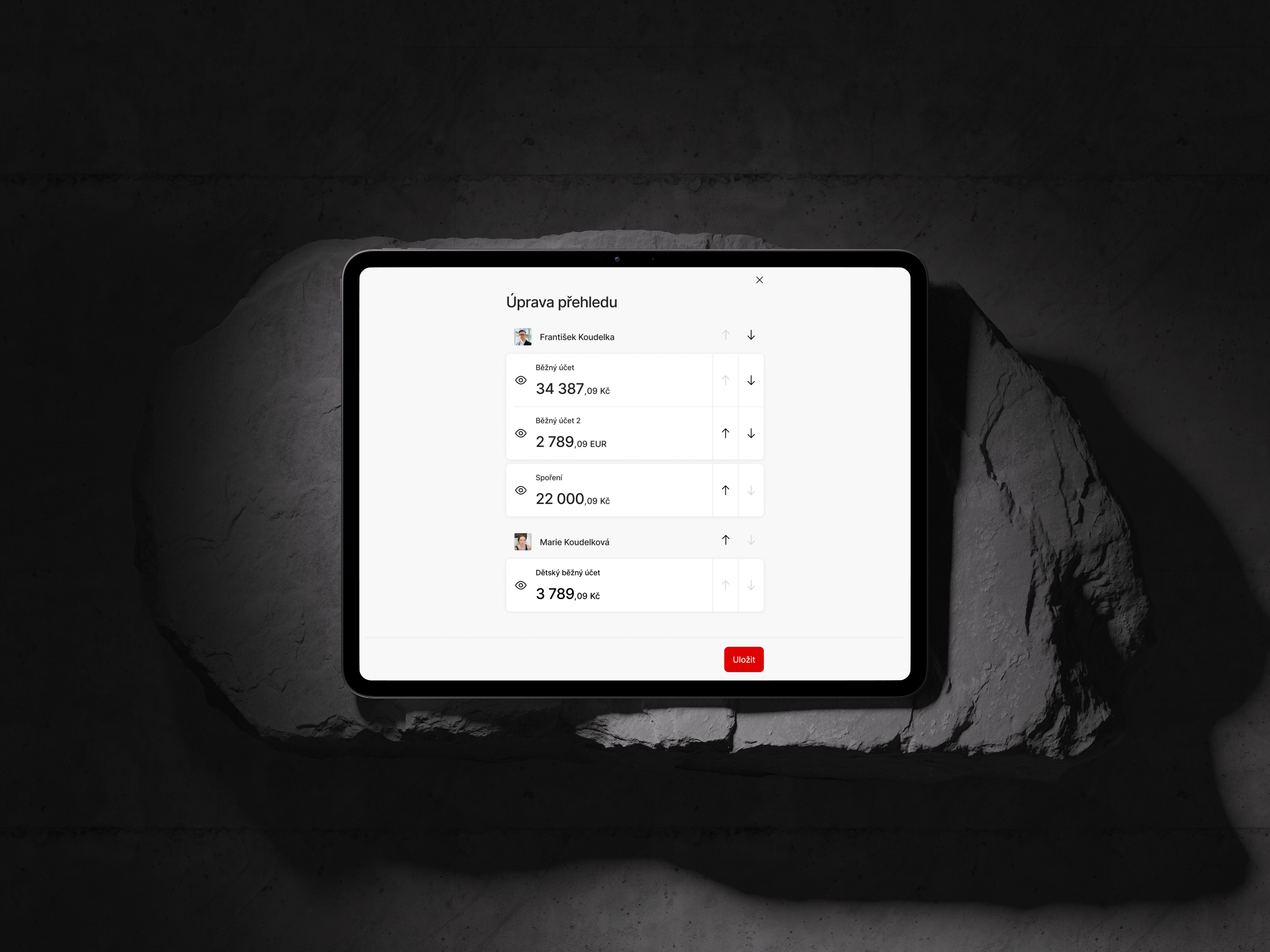
The final solution is a single customization screen that mirrors the structure of the homescreen. Users can reorder products, categories and subjects, hide or show individual items. All actions are done on one screen, without unnecessary steps. Arrow buttons make the logic predictable and fully accessible. The design is consistent across iOS, Android and Web with only a few new components added.

