Case Study.
widgets
ux design
redesign & optimization
prototyping

problem.
Users wanted a quick way to check their balance without opening the app. Widgets were available in the old application, and many users missed this feature in the new one. The task was to bring widgets back, support up to two accounts, allow users to choose between exact or percentage balance for privacy, and ensure that each account was manually confirmed for legal reasons. The solution also had to work on both iOS and Android with different widget formats.
challenges & constraints.
platform & size differences
iOS and Android offered very different widget formats. iOS had fixed sizes, while Android allowed flexible resizing. The design had to work well across both platforms without losing clarity.
data freshness vs battery usage
Widgets shouldn’t update too often to avoid high battery usage, but showing outdated financial data was also not acceptable. To balance this, I added a manual refresh button so users could update the balance instantly when needed.
security vs convenience
Due to legal requirements, all widget setup screens had to stay inside the app and only be available after authentication. This added more steps than planned, and I had to design a flow that remained as simple and user-friendly as possible.
design system
The widgets needed to follow the new design system, use existing components, and stay consistent with the rest of the app.
🛠️ process.
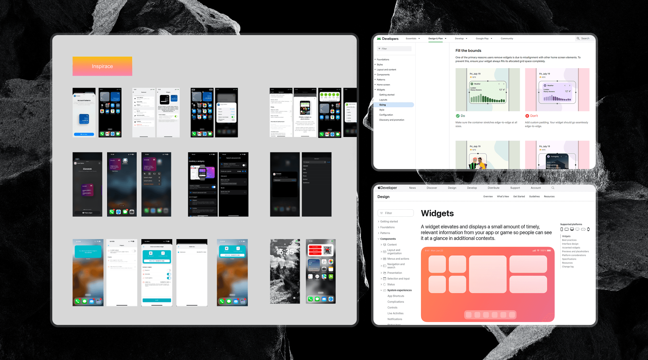
1 / discovery
I began by reviewing how widgets were used in the old app and analysing user feedback to understand what people expected from them. I also explored competitor widgets and their setup flows to identify common patterns. In parallel, I checked iOS and Android widget guidelines and discussed platform and technical constraints with developers to see what was feasible from the start.
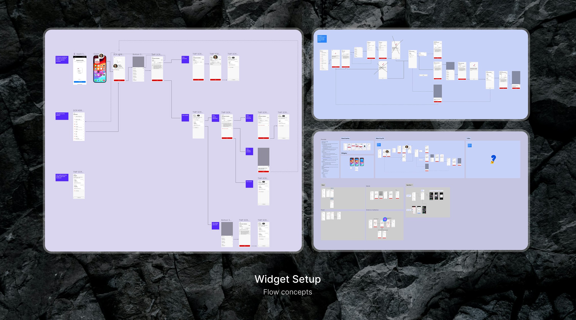
2 / exploration & ideation
I tried different versions of the setup flow and tested several layout options to see what worked best. Throughout the process, I regularly checked ideas with the product owner, analysts, and developers. Some steps had to be adjusted because of legal requirements, especially around how users confirm their choice. I also made sure the designs stayed consistent with both platforms and the design system.

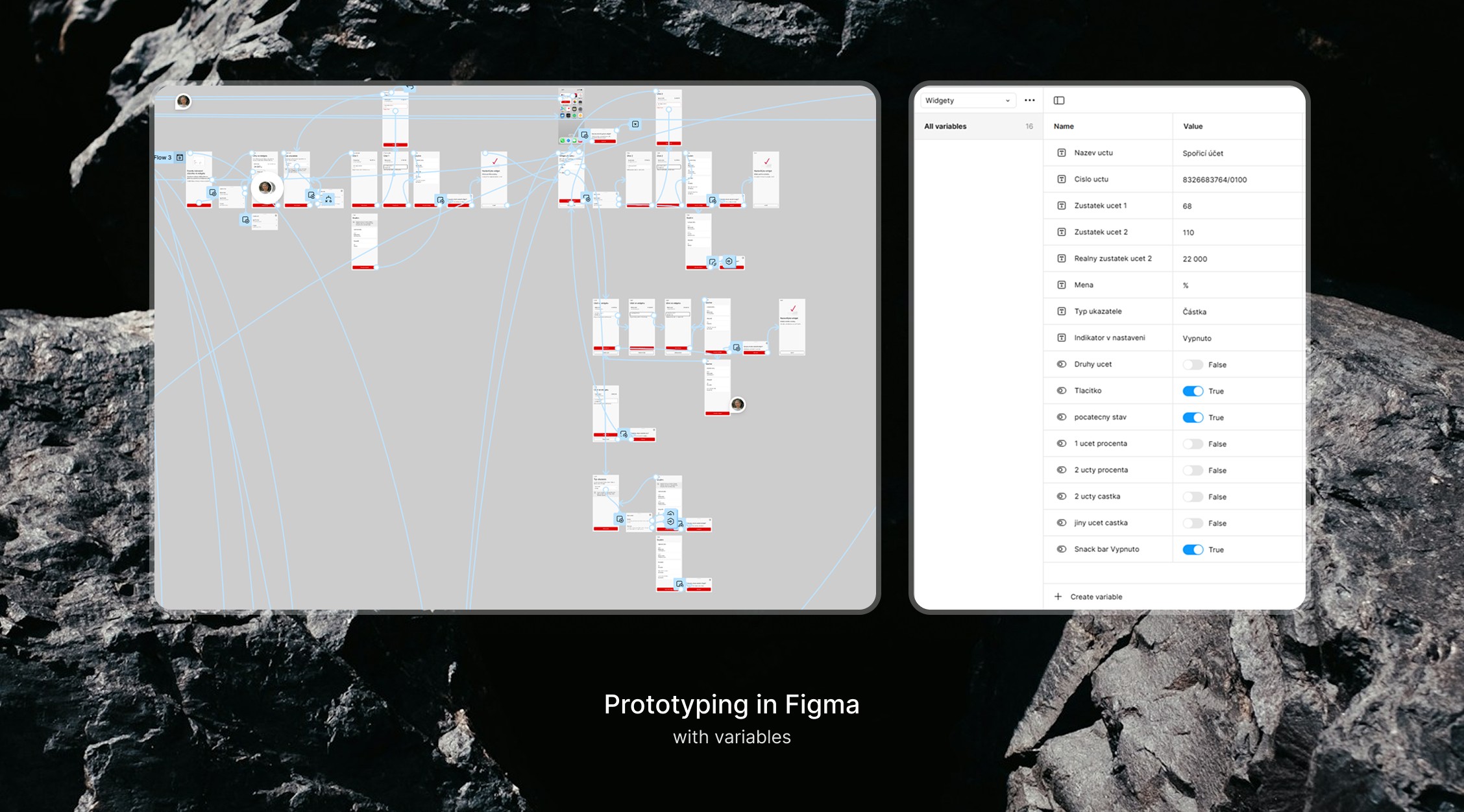
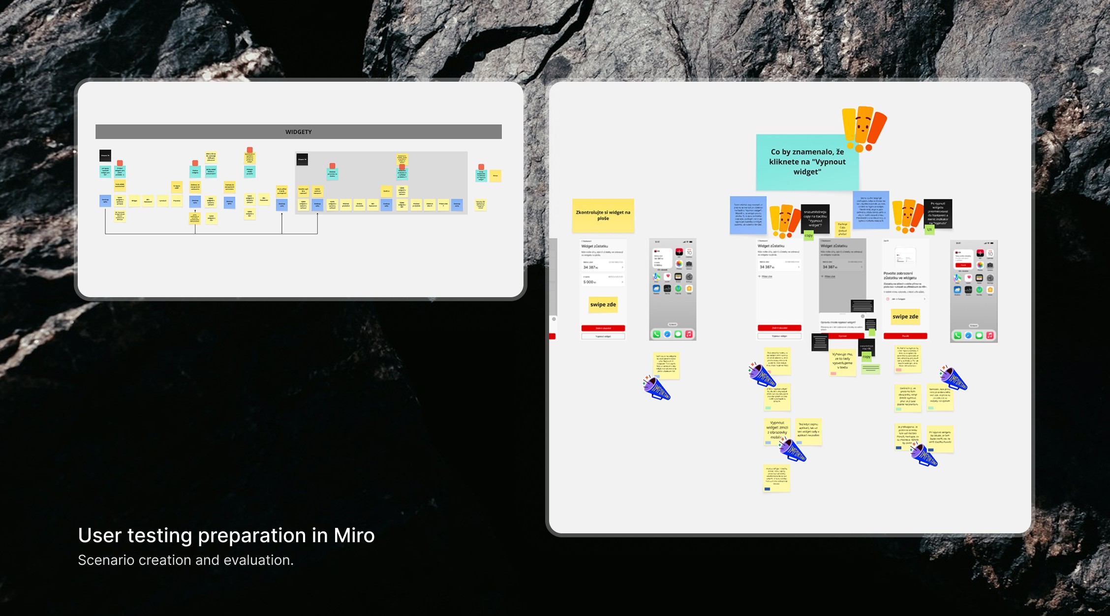
3 / prototyping & testing
To validate the flow, I prepared the testing scenario in Miro and created an interactive prototype. Then I ran user testing sessions to check how easily people could complete the setup and understand each step. Here are the key findings: