Komerční banka a.s.
banking application KB+
large team
feature-level ux
public product

client.
Komerční banka, a.s. (KB) is a leading Czech bank and part of the Société Générale Group. It serves individuals, entrepreneurs, and corporate clients with retail, corporate and investment banking solutions through both physical branches and digital channels. KB is committed to strong financial performance, innovation and sustainability, employing over 7,500 people in the Czech Republic and reflecting its focus on long-term relationships and responsible lending.
project context.
Komerční banka was undergoing a large-scale digital transformation, rebuilding its entire banking application from the ground up on new technological foundations. I joined the project during the stages of defining the app’s structure and wireframes, at a time when key user flows were being shaped. While the transformation initiative had already been in motion, my four-year involvement allowed me to contribute across multiple phases — from early conceptual work to iterative refinement.
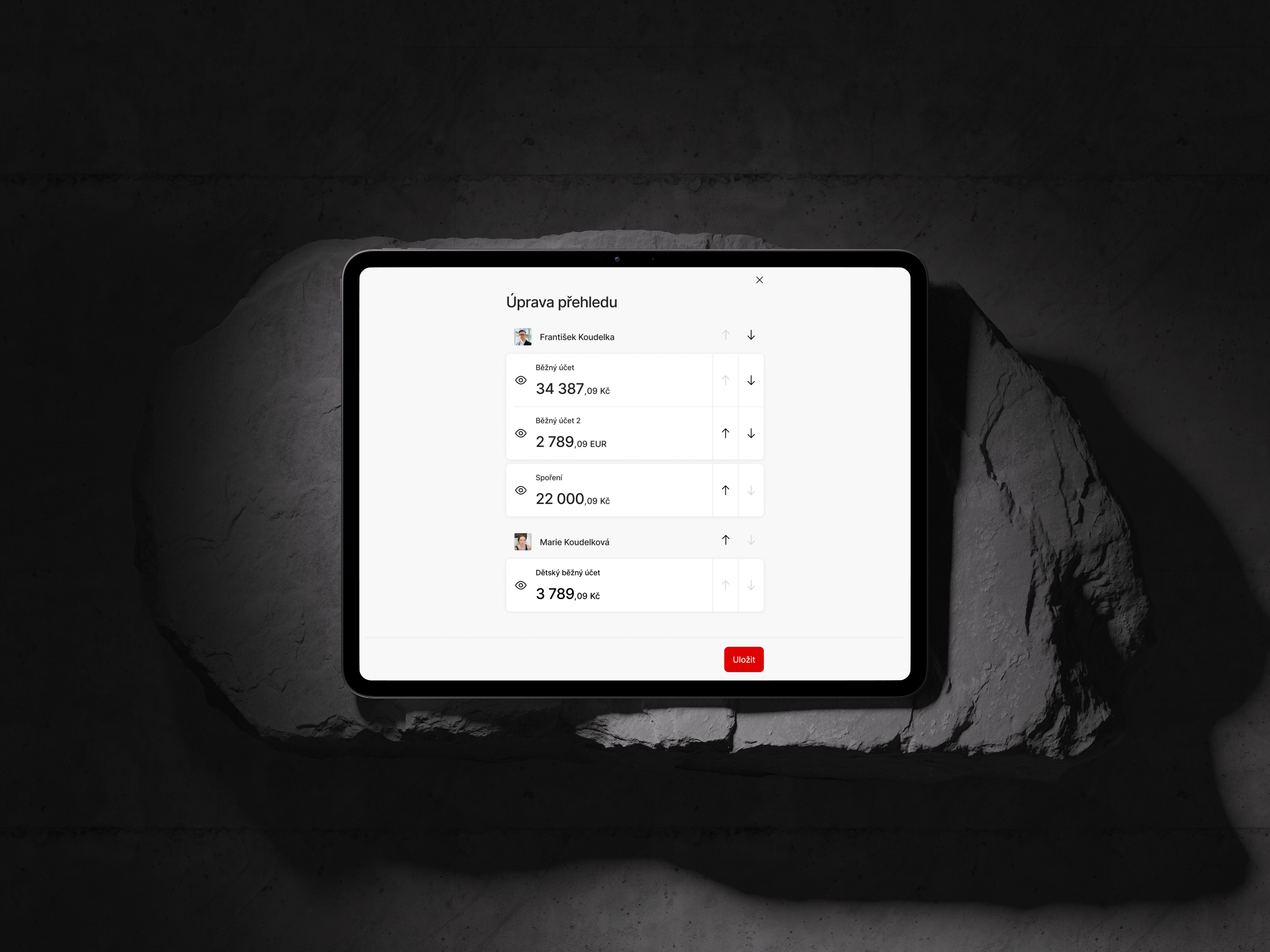
My work focused primarily on the retail segment, with additional contributions to features for small business clients. I worked on both improving and simplifying existing flows, as well as designing entirely new functionalities. Design team followed a mobile-first approach and worked on making the experience consistent across mobile and web. My goal was to help create clear, user-friendly flows inside this big ecosystem.

team & collaboration.
During this project, I worked closely with a large cross-functional team that included product owners, business analysts, developers, testers, and other designers. We shared feedback in regular design reviews, and discussed technical details with Web, iOS and Android developers.
Because the application was very complex, communication inside the team was essential. I often clarified requirements with analysts, checked edge cases with developers, and aligned flows with other designers to keep the experience consistent across the whole product. When needed, I facilitated design workshops to explore possible solutions together. I also presented my design ideas and explained my decisions to stakeholders, making sure everyone understood the reasoning behind the proposed approach.
design foundations.
The new banking app was built with a new design system that grew together with the product. When I joined the team, many components didn’t exist yet, so we often created them from scratch. As the app expanded, consistency became more important, and our focus shifted from inventing new patterns to maintaining a stable and unified system.
In my work, I used variables, auto-layouts, shared libraries, and prototyping in Figma. I aimed to keep flows simple, mobile-first, and easy to understand. Accessibility, clarity, and handling edge cases were part of our regular discussions, especially because the app needed to work smoothly across both mobile and web.